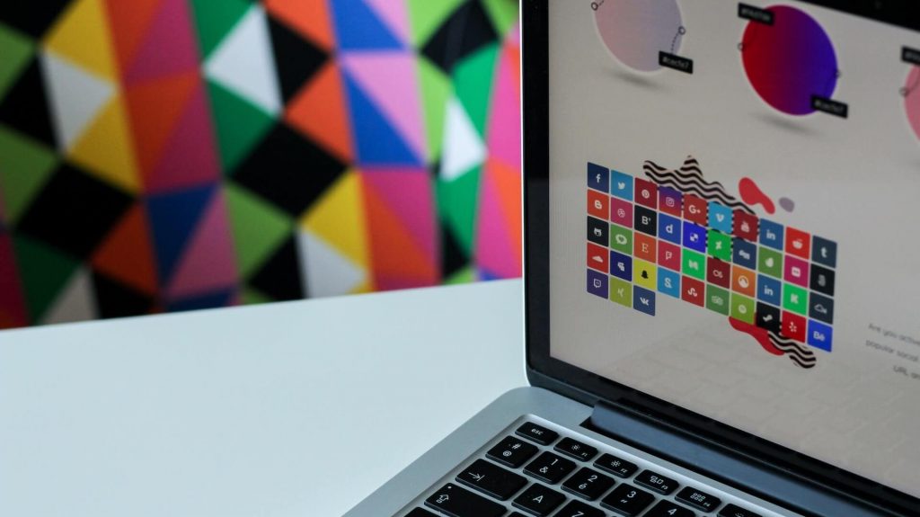
In the vast and dynamic world of web design, where creativity meets functionality, one of the most crucial elements that can make or break a website is the color palette. Colors have the power to evoke emotions, create visual harmony, and influence user behavior. Understanding color theory in web design is akin to wielding a magical paintbrush that can breathe life into a digital canvas.
In this comprehensive article, we will embark on a detailed journey through the captivating realm of color theory in web design. We will delve into the psychology behind colors, the principles of color harmony, and practical tips to choose the right color palette for your website. Whether you’re a seasoned web designer seeking fresh inspiration or a novice eager to learn, this guide will equip you with the knowledge to create mesmerizing and captivating web experiences.
Unraveling the Essence of Color Theory in Web Design

Color theory in web design goes far beyond mere aesthetics; it is a set of principles and guidelines that help designers leverage the potential of colors to communicate effectively, evoke emotions, and establish a harmonious visual appeal. By understanding how colors impact human psychology and user perception, web designers can make informed decisions that align with the website’s purpose and target audience.
Colors have a profound impact on human psychology, triggering unique emotional responses in viewers. For example, passionate red symbolizes energy and urgency, making it suitable for grabbing attention or creating a sense of urgency. However, an excessive use of red may lead to a feeling of aggression or stress. Tranquil blue, on the other hand, exudes calmness and trust, often employed by brands to convey reliability and professionalism. Energetic yellow represents optimism and happiness, making it ideal for creating a cheerful vibe, but overusing yellow might cause visual strain. Lively green is associated with nature and growth, making it suitable for promoting environmental or health-related websites. Mysterious purple signifies luxury and sophistication, making it suitable for high-end or artistic websites. Balanced neutrals like black, white, and gray provide balance and allow other colors to stand out more effectively.
The Psychology of Colors: Influencing User Perception

Understanding the psychology of colors is vital in web design as it can significantly influence how users perceive a website and its content. Here are some essential points to consider:
Impact on Emotions
Colors evoke various emotions, and understanding these associations can help web designers craft experiences that resonate with their audience. For instance, warm colors like red, orange, and yellow tend to evoke feelings of energy, excitement, and optimism. On the other hand, cool colors like blue, green, and purple evoke calmness, trust, and tranquility.
Cultural Significance
Colors can hold different meanings and connotations across cultures. It is crucial to consider the cultural diversity of your target audience to avoid any unintentional misunderstandings or misinterpretations.
Branding and Identity
Colors play a vital role in brand identity. Brands often associate specific colors with their products or services to establish a strong visual identity and evoke a desired emotional response from customers.
Color Associations
Certain industries have established color associations. For example, the healthcare industry often employs calming blues and greens, while the technology sector leans towards modern and sophisticated colors like blues and silvers.
The Art of Color Harmony: Creating Visually Pleasing Websites

Creating visual harmony is essential in web design to ensure a pleasant user experience. Color harmony refers to the arrangement of colors in a way that complements each other, creating a sense of balance and unity. To achieve color harmony, consider the following techniques:
Complementary Colors
Complementary colors are situated opposite each other on the color wheel. Using combinations like blue and orange or red and green can create a vibrant visual contrast that catches the user’s eye. When using complementary colors, it is crucial to strike the right balance, as excessive use can lead to visual strain.
Analogous Colors
Analogous colors are located adjacent to each other on the color wheel. Combining colors like blue, green, and turquoise can result in a harmonious and soothing effect. Analogous color schemes are ideal for creating a cohesive and unified visual experience.
Monochromatic Palette
A monochromatic palette involves using different shades, tints, and tones of a single color. This technique offers a sophisticated and unified look. It is particularly useful when designing minimalist or elegant websites.
Triadic Colors
Triadic color schemes use three colors that are evenly spaced on the color wheel, creating a dynamic and balanced visual appeal. Triadic color combinations are visually striking and are often used in creative and playful designs.
Tetradic Colors
Tetradic color schemes use two sets of complementary colors, resulting in a rich and diverse color palette. This technique provides a wide range of color choices while maintaining a sense of balance and visual interest.
When selecting a color scheme, consider the context and objective of the website. A website catering to children might benefit from bright and playful colors, while a corporate website may lean towards more subdued and professional tones.
Tips for Choosing the Perfect Color Palette for Your Website

Choosing the perfect color palette for your website requires careful consideration and attention to detail. Here are practical tips to guide you through the process:
Understand the Brand Identity
The color palette should align with the brand’s identity, including its mission, values, and target audience. Conduct thorough research on the brand’s personality and target market to choose colors that evoke the desired emotional response.
Limit the Color Palette
While it may be tempting to use a wide range of colors, it’s best to limit the color palette to three to five main colors. Too many colors can overwhelm users and dilute the visual impact of the design.
Accessibility Matters
Ensure that the color combinations you choose are accessible to all users, including those with visual impairments. Use color contrast tools to check if your text is easily readable against the background.
Test for Emotional Response
Before finalizing the color palette, conduct A/B tests to gauge the emotional response of users to different color combinations. This data-driven approach can provide valuable insights and help you refine your color choices.
Use Colors to Guide Attention
Utilize color strategically to direct users’ attention to key elements, such as call-to-action buttons and important information. Bright and contrasting colors can draw the eye to essential elements on the page.
Consider Cultural Connotations
Keep in mind that colors can carry different cultural meanings. Research the cultural connotations of your chosen colors, especially if your website has a global audience.
Conclusion
Color theory in web design is a fascinating aspect that intertwines art, psychology, and user experience. By understanding the emotional impact of colors and the principles of color harmony, web designers can create captivating and user-friendly websites that leave a lasting impression.
As you embark on your web design journey, let color theory be your trusty companion, guiding you through the ever-changing landscape of digital expression. Embrace the magic of colors, for they hold the power to transform the virtual canvas into an enchanting realm of creativity and aesthetics. Happy designing!